Thursday, 30 September 2010

Evaluation

I feel that overall my final piece has come together quite well and better than expected.

I started with learning new techniques in class with demonstrations using photoshop, all of which are below in my blog. The one I am most pleased with is my Orb effects piece. Reason being is because I feel I grasped the technique quite well and make a eye catching piece, I'm really pleased with how I managed to make the orbs look so realisitic and bright, and then how I managed to edit the colour around the image to make it look like the orb lights up the areas around the woman, I feel I manged to really seperate the colour balance for each other for each orb.

My main artist inspiration for my work would be the two artists Dylan Cole, and Steve Mcghee. As I was amazed by their work, I found it enjoyable to look at and very inspirational. They both inspired me as I looked at both of their work and imagined how both would look together and then pieced together an imagination for my final piece. Dylan Cole's work on Halo was his main work that inspired me, as I am a fan of the Halo games, and I greatly enjoy futuristic things and sci-fi. His work was one reason for why I wanted to do a futuristic city underwater instead of a moden city.

My final piece is a futuristic city underwater to resemble life underwater. I added a planet into my image to add to the futuristic tone and feel of the image, and making it possibly more abstract. I put rocks and sea coral at the bottom of the image to create the landscape for the image, and to leave the feeling that the city behind it drops further down and is bigger than the eye can see.

I began my image firstly with putting the blue background layer, next I got images of the rocks from the site sxc.hu, and masked off the bits I wanted and placed them at the bottom of my image, next I added my city in a new layer and put it underneath the layer with rocks, so that layer would be forward. So the city would be appearing behind the rocks. Next I got my image of the plant, and put it into a new layer behind the city, so it would appear behind the city, not in front of it, seeming distant. The image still seemed too clear, so I added the filter effect 'noise' which added small dots to my blue background layer, making it seem more underwater. To fill in some of the empty space on the right of the image, I decided to use the orb effect I learned from my demo. And smudged the image, then adding 'glowing edges' filter to make it seem abstract and dark. The image of my city still seemed to clear and stood out from the rest of the image, so I also added the 'glowing edges' filter to it, which made it darker with and glowing outlines on certain areas, making it seem wavey, as if underwater. This had a huge impact on finishing my image. I felt there wasn't enough around the rocks, making it stand out to much from the rest of the image, so I decided to add coral in front of it, filling in some of the space, which made the entire image fit altogether much better. Adding some finishing touches for realism, I got a picture of a bubble, masked it out and then used that image as a brush pattern, this allowed me to put bubbles onto the image in a realistic looking way. Finally I decided to add some text, saying "Life" to emphasize the topic of our work, I spread these around the image, then adding a blur effect to them to make the letters seem distant, I also added the bubbles coming off the letters for extra effect. I chose the aqua colour, as I felt it work best with the tone of the image and made it seem as if the letters are glowing.

Wednesday, 22 September 2010

(10) The leopard print rhino!

Another transformation work, this time getting a leopards dotted pattern fur onto a rhino!


(9) Typography

Today, we had a demo which introduced and taught us a little bit about Typography. Quite simple really, just showing us how add text to the work. By first going to windows then character, we had out text menu on the side, this allowed us to edit text font, size, colour, the spacing between words etc etc.

Tuesday, 21 September 2010

(8) Hip po pot a mus!

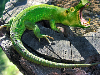
In today's lesson, we learned how to blend a hippo's head onto a lizard's body.

We started with bringing the separate image of the hippo's head into the lizard image, then rearranging the head by making it smaller then tilting it slightly, and lastly placing over the lizards head..
Image adjusted to replace the lizard's head.
Then we made a layer mask and went to adjustment layer and then colour balance, by changing the the colour balance around, we managed to change the colour of the the hippo's head green. But this made the entire image green, so we erased some of the layer mask to reveal the original colour underneath, using white on the layer mask.

But now we needed to fade the hippo head onto the lizard head. To do this we erased some of the hippo mask with a brush set with the opacity turn down slightly, so where the brush was used the hippo image would fade into the image of the lizard, ultimately creating the lizard body with a hippo's head.


Monday, 20 September 2010

(7) Copyright©

So since there was alot of questioning and confusion over copyright with using images taken from places such as Google. We had a proper discussion today as to what to do and what's allowed. So we're allowed to use images as long as we don't use them commercially. But if we wish to use the photos, we should take a professional approach to doing so, such as contacting the owner of the picture and stating my reasons for wanting to use the image and asking for their permission to use the image. Ultimately coming to some sort of agreement....or not.

(6) Poster Proposal

The concept of this piece is underwater.
So far I've got a few ideas in my head, although nothing for definite.
I have my mind set on one idea, which consists of putting a city and planets underwater. And depending how they look I'll add stars if they work with the idea. Although according the RevolutionArt site, I may not be able to stick with this plan as the issue's topic is "Underwater Life".

I may do the city as futuristic instead of modern. I feel this will make the piece more unique and work better with planets. Setting a very futuristic tone and feel. I planned to capture the effect of the picture as being underwater by creating a gradient background colour and adding noise(dotted effect) and then using some sort of filter, such as ocean ripple.

My main influences for my work are the artists, Dylan Cole, and Steve Mcghee. Dylan Cole has some amazing artwork on Halo, which can be seen in my artists post. And the whole futuristic setting in his work really inspires me to do similiar work as I really enjoy futuristic things.